Create Your First Project
Start adding your projects to your portfolio. Click on "Manage Projects" to get started
Vancouver Public Library - Rebranding
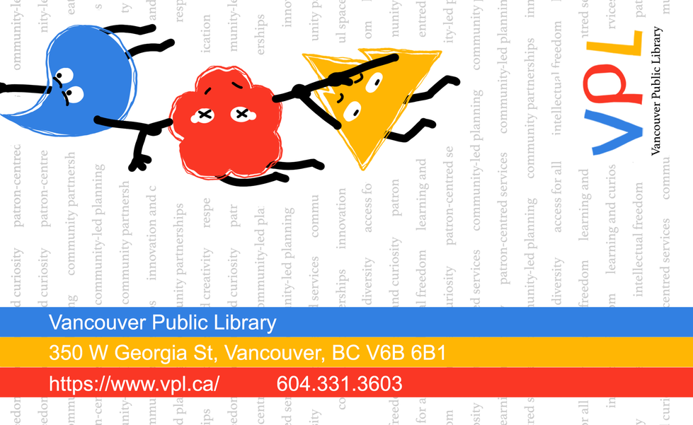
The Vancouver Public Library’s Kids Section Rebranding project is centered around creating a playful, engaging, and visually appealing identity that resonates with the youthful energy of children while incorporating meaningful elements of Vancouver’s unique identity. The rebranding integrates the city’s natural and cultural characteristics with a whimsical approach that appeals to children.
The design embraces Vancouver’s essence through three primary elements, each symbolized by a shape that represents a key feature of the city: rain, cherry blossoms, and mountainous landscape. Using the library’s color palette — azure, scarlet, and amber — the elements create a vibrant and playful visual language for the kids section.


